Showing posts with label paint. Show all posts

Wednesday, August 14, 2013

A More or Less Free Mirror for the Foyer

We're still kind of finding our groove with getting projects done now that Dave is back at work, so I just have a tiny one for you today. But free! Or, well, upcycled? That's what you say, right? I did not leave my house for any of the materials used in this project, is what I'm getting at.

Background: after I Sharpied squirrels all over my foyer, I hung up some thrift store pictures I had, but I was never really happy with them:


Those are Joan Walsh Anglund prints that remind me of my childhood, but still don't look good with silver squirrels, no matter how much nostalgia they evoke (I used to draw mouths on all the people in my Joan Walsh Anglund books with crayon when I was a kid. Because Joan Walsh Anglund doesn't believe in mouths, and apparently I thought this was a little creepy. And maybe I still do. No mouths?! Why?! The stuff of horror movies.)

I wanted a mirror there. And at one point I bought one that I was going to paint and hang up there, only I wound up hanging it up in my bedroom, over The Most Beautiful Chair in the World Instead:


But! Back when we redid Ari's desk, we saved the mirror that we took off it and stuffed it in our laundry room closet:


So, when I was looking for a quick, cheap project the other day, I whipped the mirror back out to make over for the foyer.

First I leaned it up against the foyer dresser so Abe could look at himself in it:


Then I took off those little knob things that used to connect it to the desk (although they're sort of cool; I like the shape. I wish I could think of something to do with them. To make my upcycling even more complete!)

Then I taped up the glass while Abe played with my frog tape:


A coat of primer:


For some reason, I decided that the perfect place for this project was right in the middle of the kitchen floor, blocking the doorway to the dining room.

I'm all about finding places to use up paint samples, so I whipped out the Gray Owl that we rejected for the kitchen (and seeing how very close to white it looks on the mirror very much reassured me that we'd made the right choice. It would not have worked in the kitchen at all, I don't think).

A coat of Gray Owl:


...and then I put a layer of finishing wax on it (also already in my house!)

It didn't have a hanger on the back, of course, since it had been attached to the desk, so Dave broke out our seemingly bottomless picture hanging kit (seriously; we've had that thing for a decade now, I think, and it's never run low), and strung a wire across the back:


And then we hung it up!


It makes the foyer look very bright. Of course, the foyer IS very bright.

I got so into taking the pictures that I had to open the front door and go outside to take some so that I could get the whole dreser in there. The resulting pictures really make it clear how much we need to paint that hallway back there. And also I think the foyer needs a rug.


Linking with:
Give Me the Goods Monday
Tuesday's Treasures at My Uncommon Slice of Suburbia
Tutorials and Tips at Home Stories A to Z

Thursday, August 1, 2013

Mini Kitchen Makeover: I Sort of Hate the Word Greige


At some point over the past couple of weeks of doing this mini kitchen update (I'm hoping for a bigger kitchen update sometime soon, as discussed here) I realized that my kitchen could now be a museum exhibit from the future: "Typical Blogger's House, c. 2013." Granite countertops. Farmhouse table. Chalkboard Wall. And now....greige walls. Benjamin Moore's Revere Pewter, specifically.

I didn't mean to paint the walls Revere Pewter. I was resistant because everyone talks about how awesome it is, and I didn't want to do the same thing as everyone.

Also, apparently, I really wanted a paint color that was named after an animal, because I went to Benjamin Moore and came back with samples of Gray Horse and Gray Owl:


That's Gray Owl on the left, and Gray Horse on the right. I liked them both, but neither of them was really right for this room.

The kitchen is one of the rooms that had been updated by the former owners. The cabinets and counter tops and backsplash are all newer, good quality stuff. But not what I would have picked and kind of limiting in some ways. The cabinets are a light colored, sort of orangey wood. The granite is gray-brown speckly. The backsplash is, I believe, tumbled marble--really nice and really....tan.

I've had a really hard time picking a color for this room. I've been gravitating toward cooler colors, lots of blues, for most of the house, but that just wasn't going to work in here. So I liked Gray Owl, but it was too silvery and cool to go with the tile and counter tops in the kitchen. Gray Horse was closer, but it was a little dark and looked too green in some light.

The worst thing about Benjamin Moore is that they don't sell a true sample size of paint. You have to buy a pint, and they cost something like $8. This can add up very quickly when you have no idea what paint color you want.

So after those two didn't work out, I just went all in and bought a whole gallon of Revere Pewter. I had been looking at it online in 100 different rooms for pretty much a full year, after all, so I figured I had a pretty good idea of what to expect.

And.....

Well. You know how sometimes after you've painted a room, every time you walk into that room you're struck by how different and awesome it looks? Yeah. That didn't happen. It went from a  neutral yellow to a  neutral beige-y gray.

Which is not to say I'm unhappy with it. I think it's exactly what the kitchen demanded. The main thing Revere Pewter has going for it is that it's truly, truly neutral. It has no blue or pink or green undertones like a lot of grays and beiges and taupes do. It is all tan and gray. And it's very pleasant. It's just hard to get excited about it. I know some people manage to, based on all of the glowing Revere Pewter reviews online. I'm just not a very....neutral person.

One thing I'll give it--I totally and completely understand why someone had to invent the word greige now. As soon as it went up, I was all, "it's gray! no, it's beige! gray! beige!" It's pretty much impossible to decide. As near as I can figure, it looks more gray the more natural light is hitting it.

So here it is:


I took it from this angle so you can see the granite and cabinets in the same shot with the walls.


And here's the other side of the kitchen, as clean as it ever gets!


So there you can see it right up against the cabinets on that one wall on the far left, and also next to the backsplash. I think this is a good representation, too, of how it looks much beiger without natural light. This half of the kitchen only has that one window that goes into the sunroom; it's very dark without the overhead lights on. The other half has the big bay window to gray things up. Although the bay window goes to the screen porch, so still not as bright as it could be. And as it WILL be if I get my wish to knock the wall out there. I guess I should mention that the gray side of Revere Pewter is my favorite side, so I'm hoping to bring it out more by bringing in more natural light. Someday.

Oh, one more thing re: paint. I sent Dave out to buy the paint, and he had to go to not our regular Benjamin Moore store, because that one's closed on Sundays. I told him I usually ask for the "middle" quality paint. So when he came back with this "Regal" paint that cost nearly $50 (!), I thought he'd totally been scammed. We usually pay more like $35. But I have to say--that paint? was incredible. We didn't prime, just slapped a coat on there, and there was no question that one coat was plenty. This never happens to us. We always have to at least go back over big portions with a second coat, even if we don't redo the whole thing. Also, we barely touched the gallon, between the amazing coverage and how most of the kitchen is cabinets and windows and such. I think I could paint my whole house with the rest of the gallon. Not really. But definitely my den. And I just might.

Linking with:
The Inspiration Gallery
The Shabby Nest's Frugal Friday
Inspire Me Please
Tatertots and Jello's Weekend Wrap-Up Party
Monday Funday
The Inspiration Exchange

Monday, July 29, 2013

The Illustrated Kitchen Wall


Are you ready for this? I'm about to BLOW.YOUR.MIND.

There is this paint that you can buy that turns any surface in  your house into a CHALKBOARD. 

True story.

Okay. I suppose at this point talking about how overdone chalkboard walls are is pretty much as overdone as chalkboard walls themselves.

But what about talking about talking about how overdone chalkboard walls are?!

See? Right? I just blew your mind, didn't I?

So I mentioned wanting to make a chalkboard wall in this awkward little corner of the kitchen back in the plans/goals post at the end of last year:


Maybe now you're all, "hey! you were just talking about wanting to move that refrigerator! So why are you wasting all this time chalkboard walling?! Huh? Why?"  Well. When that happens I think we will keep the lovely chalkboard wall and frame it out somehow. With wood. It will be nice.

I used Rustoleum chalkboard paint. I primed it and then put on five coats (yes! five!) and it still only took around half the quart.

One coat in, it looked like this:


It took a couple of days because each coat was supposed to dry for four hours before recoating. I used a little smooth roller and kept it in the fridge, wrapped in plastic wrap, between coats:


After the fifth coat, we let it set for 4 days, because this is what Rustoleum told us to do. Then we primed it by covering it with chalk and wiping it off, because this is what all the other blogs told us to do:


Then I referenced art and took pictures:


The kids descended on it immediately:


Within an hour it looked like this:


And within a day it looked like this:


So that's kind of fun. Then yesterday we had a three year old over, so I went to erase everything so he could draw on it, and realized from the kids' (mostly Gus and Ari) angry protests, that they wanted to keep the wall just how it was FOREVER. I felt this was impractical and silly. So we're still negotiating on this point.

Here's what the awkward corner looks like now:


Linking with:
Inspiration Exchange
Stone Gable's Tutorials, Tips, and Tidbits
The Inspiration Gallery
The Shabby Nest's Frugal Friday
Inspire Me Please
Tatertots and Jello's Weekend Wrap-Up Party
Monday Funday

Friday, June 21, 2013

Painting the Sunroom

The sharper eyed among you might have noticed in Wednesday's pinwheel post that the yellow is finally gone in the sun room! But you can't really tell what color it is in that picture, because it's so, so light. It's the lightest I've ever painted a room, ever. Some people are afraid of color; I'm afraid of white walls. And these walls aren't white! But they're closer than I've ever come before.

Dave was startled when I pointed to the color on the card. "THIS one?! Are you sure? It's almost white." But, I mean, it's a sunroom, right? I wanted something cool and light and airy, with the idea that most of the color in the room would come from accessories and whatnot (eventually. We have very few of said accessories and whatnot at the moment).

We started out, as you'll recall, here:


This is before we bought the house. Same yellow paint as everywhere else in the house and a giant leak above the door on the far end there.

We had the leak repaired (and the skylights--suspected source of leak--removed and drywalled over) before we moved in. And then we put a dog crate in it and left it that way for a year:


In the past few months we've made some progress in here. We refinished that big ol' dresser that's up against the windows in that picture. And we moved the dog crate out and some real furniture in so that we could hang out in here.

The next order of business was to finally get rid of both the yellow and all that bare drywall from the leak repair.

My paint selection method was pretty simple: I took the card from the paint I used on the big dresser (or, as Dave would say, credenza), (which was Benjamin Moore's Florida Keys Blue) and picked the lightest color. Which, it so happens, was called Blue Bonnet. This led me to expect it to be more, well.....blue than it turned out to be. It's a really light blue green, but, if pressed, I'd call it green rather than blue. But, then, the Florida Keys Blue dresser is the same way. Most of the time, I'd call it blue, but in certain lights it's definitely green. I'm going with aqua, because that's what I had in my head that I wanted.

This room took forever to paint. It is very big. And we had to paint the ceiling, which is also very big. And three of the four walls are mostly windows, which meant less surface to cover with paint, but also lots and lots of painstaking brush work.

We did primer first, which is not our usual way. But it was clear from the test patch I put on the wall that it was going to take at least 2 coats otherwise, and primer is cheaper than paint. Plus the internet tells me that my paint job will look way more professional with the help of primer, and if the internet says it it must be true.

Two days later, we had this!


It's so light you're not really sure what color we painted it, right? Yes. It's a big, minty box.

You can see the color a little better from this angle, I think:


Here's a beginning stab at colorful accessories and whatnot. That little thrift store lamp (I recognize the shade from Target, but I got it at the thrift store) is the only source of light in the room, still, but we have a plan that might actually work for fixing the fan light. Saving that for another post.


With the dropcloth curtains down (they need to be hemmed and cut into panels before they go back up), you can see what rough shape some of the window are in. I'm scared to hear how much it will cost to replace them.

And, because I don't want to do a whole post about it, I got unlazy enough to move the pinwheels into the dining room and throw together some 4th of July-ish stuff on the buffet in there. I kept bringing in more and more books, so I'm pretending an American literature theme was my plan all along. Mark Twain is heavily featured. I want to switch out the flowers for president cards, but....uhh, well, I haven't yet.


Monday, March 11, 2013

A Subway Map Inspired Dresser for Ari's Room


Not going to lie; I'm pretty excited about this one. It's a project that could not be a Pinterest Challenge, because I came up with it all on my own. Not that a striped dresser is anything unique, but I haven't seen any other subway map striped dressers.

Back when I posted about the plans for Ari's room, I mentioned that I had printed out a map of the London Underground for his wall. Somewhere along the line (ha! along the line! it's kind of a pun!) that map inspired the plan for his dresser.....a sort of stylized subway map.

Here's what it looked like before:


This one was kind of a pain. I've never painted stripes on....anything before, I don't think. It was super tedious, but the end result was worth it. We sanded it down and then painted it (with a little foam roller) the same semi-gloss Valspar High Speed Steel that we used on his desk and nightstand.  No plaster of paris this time, because I wasn't planning to distress it and wanted to keep it all sleek and modern-like.

Then we started on the stripes. I'd picked up three paint samples at Lowe's, but I decided that two of them were too close to the same color, so I wound up using the leftover Newburg Green from our bedroom for one of the stripes instead.  Pretty much we measured out where we wanted them, then drew a line in pencil with the help of a level, then taped off with frog tape:


After the first stripe, a good bit of gray came off with the frog tape. I thought we just hadn't been patient enough, so we let everything dry for a full two days before we attempted stripe number two. And this happened:


At that point we realized we were just going to have to go back over and do a lot of touching up once the stripes were finished. And that we did. Then a coat of polyurethane (which, as you'll see, did not dry very clearly on the blue, but I'm trying not to care too much since I'm not sure what to do about it). I finished it off with simple (cheap!) bronze knobs from Lowe's....we bought a pack of 10 for $14, I think.

So the whole thing took a lot longer than I had planned, but we finally finished this morning. And here it is!


I love where the lines intersect. It's my favorite. The stripes keep going on the top and the sides. You can rid the subway all the way into the wall!


We're all finished with furniture makeovers in Ari's room now. I'm pleased with them all....I wanted something a little different for each piece, but that meant there couldn't be anything completely wacko or they'd be overwhelming when you put them together. So I think I hit on the right amount of wacko.

Now we need to do his headboard, and curtains, and work on art for the walls. I still have that AMAZING idea that I keep way overhyping. I'm scared to try it because I'll be crushed if it's not as awesome in real life as it is in my head.

Linking with:
Creating with the Stars Weekly Link Up at East Coast Creative
Spotlight Saturday at Classy Clutter
I Heart Naptime's Sundae Scoop
Monday Funday
Tutorials and Tips at Home Stories A to Z
Tuesday's Treasures at My Uncommon Slice of Suburbia
Stone Gable Blog's Tutorials, Tips, and Tidbits
Hookin' Up With House of Hepworths
The Inspiration Gallery
Miss Mustard Seed's Furniture Feature Friday
Tatertots and Jello Weekend Wrap Up Party
Thrifty Decor Chick's Before and After Party
Before and After DIY Contest

Wednesday, March 6, 2013

Fourteen Eggs....Transformed! (Much Like the Bunnies Were, Only Different)

I continue to decorate for Easter. Those who saw this picture (or a similar one) on Instagram:


....will observe after this post that I'm getting pretty close to the bottom of my giant pile of Easter decorating stuff.

Today we deal with eggs, the natural follow up to bunnies, of course.

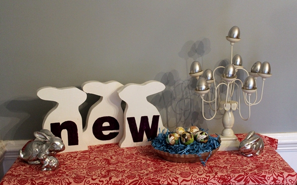
See that funny white candle holder thing? I picked that up for $4 on my fabled Friday night thrift shopping expedition. I think it might be the least safe thing ever to actually put candles in...it's really wobbly and it looks like it's been repaired with surgical tape in one place. But I liked it, so I got it anyway, and then when I got home with it, I thought, "you know what's shaped pretty much exactly like candles? EGGS!" Well, that's not exactly what I thought. But something along those lines.

I had a few different ideas for what kind of eggs I was going to stick in there, but it didn't take long for me to realize that of course I needed more shiny silver things in my Easter display. So I broke out the Krylon again, along with a bunch of plastic Easter eggs, and set to work:


Magic!

And here they are in the funky candelabra:


I find the shadow on the wall very distracting, but I couldn't make it go away. The sun is stubborn like that.

Then I had these styrofoam eggs from Hobby Lobby, and I also, it just so happens, had some Little GoldenBooks that I picked up a few months ago specifically to destroy in some crafty project. I decided to use "My First Counting Book" because it had pictures of ducks and bunnies and other Eastery creatures in it.


It's kind of sad that I tore up the book because now Abe will never learn to count, but I'm not about to let my baby's education stand in the way of my craftiness.

After an intense and prolonged search for the Mod Podge ( turns out I had packed it up and put it in the basement for some reason), I got started on the eggs. Basically, I tore the counting book into little pieces and Mod Podged them onto the eggs:


The end result is colorful and a little creepy, because the eggs are covered with little decapitated chick pieces and whatnot:


I put them in an old pie tin that I found at a different thrift store a couple of weeks ago. Vintage pie tins are the new Easter baskets.

Also, I had this....I don't even know what it's supposed to be...this....fabric that I bought awhile back and never knew what to do with. So I brought it down and put it on the old lady cabinet and then set all my Easter stuff on it:


One more project! And then I will stop bombarding you with Easter stuff! I feel much more in my element painting dressers and cutting out whales and stuff, but it's good to challenge one's self with some holiday decorating from time to time, right?

Linking with:
Hop to it Link Party