Friday, August 30, 2013

The Foyer Rug and Problems with Perspective

I have a history of ordering things online and expecting them to be much bigger than they actually are. One time I ordered a bunch of stuff for the kids for Christmas, thinking confidently that I had ordered them so much stuff; it was going to look like TEN Christmases when it got here. I wouldn't need to buy another thing! And then the box arrived, and I was like, "oh, they must be sending it in.....SEVEN boxes. This box is far too small for all of the amazing things I ordered." Only then I opened up the box and there were all the toys...miniature versions of what I was sure I had ordered.

Mind you, no one had been dishonest or tricked me in any way. I just don't pay attention when they tell you what sizes things are. This has been going on pretty much since ordering things off the internet was first invented, and I have NEVER learned to stop doing it.

I've made a helpful graphic to illustrate this problem I have, using Abe's toys:


Okay, so! I actually DID know exactly how big the rug I ordered for the foyer was. And I had measured the foyer, so I knew how big a space it was supposed to occupy, too. But somehow, getting these two numbers to meld together in my head did not work very well.

But let's back up.

A little while ago, I presented some of my finalists for the coveted position of New Foyer Rug and asked you guys to help me pick one. I'm not even sure which one won, because a lot of you mentioned your top two or three instead of just picking one, and then some of you said, "the purple one," and there were TWO purple ones. I think you probably meant the purple one that I didn't actually buy, though. Also the vote was fairly evenly split, it seemed like.

So that part wasn't really all that helpful, although I know everybody tried their best. What WAS super helpful, though, was how a few people pointed out, either directly or indirectly, that this rug was going to be right by my front door, for everyone who came in or out of the house to trample over. This was something that seriously had not even occurred to me in my "ooh! pretty rugs!" fervor. I eliminated the popular but mostly white Moroccan dhurrie right then and there. And then I went ahead and tossed out the wool choices, hoping that the cotton ones would stand up better to being tossed in the washing machine (I'm not sure if you're really supposed to toss your cotton rug in the washing machine, but I think I'm probably going to give it a try whether you are or not).

Maybe at this point I should mention which rug I bought?

I went with......


The Zig Cotton Dhurrie from Serena and Lily!

Once I decided on cotton, there weren't many choices left, but this one had originally been my and Dave's favorite anyway. I found a coupon code online, and it was already marked way down, so it also wound up being one of the cheapest (after shipping, I think we paid just under $70). And since the original price made it one of the MOST expensive choices, I felt like I was getting a FANCY rug. And you know I loves me some fancy.

So my rug got here, and I eagerly unwrapped it, and....it was....small.

To be precise, it was exactly what size it was supposed to be. Only that was smaller than I had pictured.

Well, here, take a look (child and beagle shown for size comparison purposes. And because they wouldn't get out of the way):


That's not a rug! That's an overgrown door mat!

The good news is, it turns out the rug is exactly the right size for the space between the bench and the stairs. Which is great, because maybe you'll be sitting on that bench with your feet on the floor? And they would be cold? Only they're NOT because of the rug! Yay!


But that still leaves the problem of my rugless other half of the foyer.

But the good news THERE is that layering rugs is totally trendy right now. I know because I read it on Apartment Therapy.

So that's what I'm thinking now. ANOTHER rug! This time bigger. Like all the way to 5 by 7 (that one is only 3 by 5). Overlapping with rug #1.

Who wants to help me out with rug shopping again? Rug layering good or bad? What kind of pattern/color/etc. would you go with there?

Linking with:
Link Party Palooza
The Creative Connection
The Inspiration Gallery

Thursday, August 29, 2013

Nursery Gallery Wall Additions and Overview

We made a couple of new additions to Abe's gallery wall the other day. And I was thinking, too, that it came together so bit by bit that it might be good to do an overview of everything that's up there now (although I am not declaring it finished. It might never end!)

New things first:


This is a patch with a river otter on it that I picked up last time we visited the Tennessee Aquarium, then taped to piece of white cardstock and stuck in the cheapest frame Ikea sells. I think I paid $3 or $4 for the patch, so some pretty cheap wall art. I like it because 1. the colors are right! 2. Abe had already visited the aquarium twice by the time he hit six months old, so it seemed like a souvenir was in order and 3. OTTER! (it's not entirely thematically appropriate, since it's a river otter and not a sea otter. But close enough).


On the right is one of Abe's seven month pictures. I have a newborn picture and a three month picture of him, and now this one (plus one of him with all his brothers).

And on the left is maybe my current favorite thing on the wall...this downloadable/printable Where the Wild Things Are quote/graphic from Olive and Birch via Etsy. I generally have mixed feelings about hanging wordy things on the wall, but actual real quotations from books I can totally get behind (here is where I was going to insert this thing about how I wish it said what it really says in the book, which is "We'll eat you up we love you so" ....then I looked at the listing again and found the place where it says "Also available in We'll Eat You Up We Love You So." Oops. So I'm stuck with the not-quite-how-it-is-in-the-book "I" version because I'm not a careful reader. Ironically.

(When I was applying to grad school, to get an advanced degree in English, I was such a not careful reader that I accidentally applied for a program that didn't even exist at one school. They let me in anyway, after calling to clarify which of their real programs I had meant to apply for).

Okay, so anyway, the way this went down was that last week East Coast Creative had a post with 12 free nursery printables. I have a nursery, and I like free things, so I picked out a couple of my favorites and sat down to print them out. But I could.not.get.them.to.print.the.right.size! It was frustrating. They kept being either too big or too small, and I had no clue why.

I gave up.

Then I scrolled down to the section where they threw in some bonus not quite free printables and followed the link to Olive and Birch on Etsy. And I found that print up there that I loved so (so much I could eat it up). I'm not sure why I was so confident that THIS would print out correctly. I guess I figured that paying $5 gave me some extra protection. Like  if it DIDN'T print out correctly, the owner of Olive and Birch would fly in from Utah to fix my printer for me, because I'd paid five dollars.

But it printed out just fine with no such intervention necessary. And now it's on the wall and it makes me happy.

And now here's the whole thing (so far):


Those numbers aren't there in real life. I put them in with MAGIC.

1. I just talked about that one!

2, 4, 5. This is where it all started! These three prints are all pictures I've taken on family trips to Cape Cod.

3. Abe's 7 month picture

6. Ari designed this sort of graphic birth announcement, with minimal help from me.

7. Gus drew this whale picture for Abe.

8. Newborn baby Abe

9. Koi print from the Biodiversity Heritage Library

10. Milo made this 3D Lego shark

11. 1st photo ever of all 4 boys (in hospital) (I talked about this first big gallery wall expansion here)

12. Abe's 3 month portrait

13. More biodiversity library prints....narwhal and seal

14. the river otter!

15. photo of jellyfish I took at the Georgia Aquarium

I love looking at this wall, and I love the mix of things. Nothing on this wall was expensive, but most of it has some sort of personal meaning. And the things that don't are awesome anyway because they're narwhals or whatever.

Linking with:
The Inspiration Gallery
The Creative Connection
The Shabby Nest's Frugal Friday
Link Party Palooza

Tuesday, August 27, 2013

Ikea and the Boxy Colonial


This week I got together with those five other bloggers up there to do a whole house full of all Ikea mood boards. (You can see all the mood boards here).

Today we're continuing our Ikea-splosion by each doing a more general post about using Ikea in your house. Because, generally speaking, you don't really fill a room ENTIRELY with Ikea stuff. So I'm going to ramble a bit about how I've used Ikea in my actual, real life house. (these posts/mood boards are, btw, entirely unaffiliated with Ikea--no perks or payment or even encouraging pats on the head were given to us in exchange for doing them).

(Incidentally, you kids who have just recently started decorating houses don't know how lucky you have it. When we bought our first house in Boston, back in 1999, the closest Ikea was in Newark. We'd make the trek there occasionally when we visited Dave's parents who, at that time, lived in New Jersey. Sometimes blogging makes me feel old. Kids today! In my day, we had to walk uphill in the snow both ways drive to Newark to get to Ikea

I don't think of myself as having a particularly Ikea-y aesthetic, comparatively speaking. I am definitely more into clean, modern lines than my former self was, but I still tend to like to put something old/vintage in every room, too. And of course my house is a really traditional style, so I feel like there's probably a limit to how modern I can make it without hurting its feelings and making it think I want it to be something its not.

But, at the same time....Ikea is awesome. And sometimes the thing you really, really need, no matter what your house's style, is the thing they have at Ikea. I was surprised when I started going through the house in my head by just how much I've used. Way too much to talk about every single thing, but I thought I'd do a quick tour of the highlights anyway:

The Library:


The library is to the left off the foyer, so it's pretty much the first thing people see when they come in. We get a lot of compliments on it, and I'd like to pretend that it's because of my amazing design sense, but the truth is the Billy shelves are doing all the work here. We'd originally planned to frame the open shelves out for a built in look, but we got a little nervous at the last minute about our abilities there (particularly going around that corner), so we opted for buying the glass doors instead to give everything a finished look. So, while I think a lot of times the key to using Ikea is to tuck it seamlessly into a room full of things from other places, sometimes you just have to let your Billy shelves shout, "we are from Ikea! And we're AMAZING!"

Abe's Nursery:


The nursery, on the other hand, is a good example of where the Ikea stuff kind of recedes into the background and lets everything else steal the spotlight. I think the only Ikea accessory in here is a pillow that's usually in that rocker (and the stuffed animals, if you want to count toys as accessories), but the crib, rocker, and all the frames are Ikea (as well as the curtains we used for the room divider). All the furniture in the room is either repurposed, second hand, or Ikea, which really kept the total cost of the nursery down. I'm not one to get all excited about a fancy, expensive crib...this one is perfectly attractive and works just fine. I'd much rather do my big furniture spending on things that are going to be used for more than a couple of years (or, you know, not do any big spending at all...when Craigslist is cooperating). The only things we had for this room when we started were the little bookcase and one of the dressers (both of which we refinished). I never did a super precise price breakdown in here, but I did add it up quickly in my head one time, and we spent a grand total of around $900 for absolutely everything...not bad considering we didn't even start off with four whole walls.

Ari's Room:


...and I'll finish up with Ari's room as a sort of middle ground between letting the Ikea fade into the background and having it hog the spotlight. Ikea products figure pretty prominently in this room, but they're sprinkled in here and there with plenty of DIY projects and pieces from elsewhere. The bedding is Ikea, the lamp next to the bed, that Bing Bong print over the dresser, the chair cushions, and some of the frames.

Now hop on over to see what my fabulous collaborators have to say. I'm excited about this part. Truth be told, I had already seen the mood boards before they went live, but I have no idea what the meta Ikea posts are going to say. Surprises! I love surprises!

Amber at Wills Casa
Anu at Nalle's House
Ainhoa at A Little Bite of Everything
Katja at Shift Ctrl Art
Kim at Newly Woodwards


Ikea Dream Home + Blogger Style: All the Mood Boards


Yesterday I showed you my bathroom mood board. Today I give you.....ALL the boards. A house tour. It's like going through one of those fake Ikea apartments, only bigger and you don't have to leave your house, and you don't have to go during the Superbowl to avoid the crowds. And everyone's board is so great! I had so much fun seeing them all and feeling intimidated. No, really--it was a wonderful experience getting to do this in such good company!

I am a little entertained by how much overlap there is between the different boards. It makes me want to go to Ikea and buy, say, that black and white rug or the black and green walnut wall hanging twice and put them in different rooms just to confuse people when they come over. "Wait--didn't I just see that in your living room?! What kind of crazy house IS this?!" They would say. While I laughed in a slightly menacing way. If you didn't get a chance yesterday, check out the original posts to read about the rooms in more detail and what the inspiration behind them was and all that stuff.


Monday, August 26, 2013

Ikea Dream Home + Blogger Style: Bathroom


When Katja at Shift Ctrl Art came up with the idea to get some bloggers together to make an Ikea dream house, I jumped at the chance to participate because imaginary shopping=fun and free! And because all those other guys up there are amazing, so being asked made me feel important and special. 

The idea was for each of us to create an all Ikea mood board (completely unofficial and un-Ikea-affiliated) for one of six different rooms/spaces. Put them all together, and you have a whole house! The rooms were randomly assigned, and I got bathroom. In addition to all the fun, this was a good project for me because it forced me to work on the long neglected blogging 101 skill of mood board making. I used Polyvore for the first time, and I was very pleased with it. It was easy and intuitive. Anyway--here's my bathroom:


123456789101112131415161718192021


I was pretty excited when I found out I'd be doing the bathroom, because my master bath is currently the saddest, most neglected part of my house. I'm hoping that all of this imaginary bathroom planning I've been doing will spill over into some real life bathroom work very soon. 

Ikea does not sell stuff like floor tile or paint (or bathtubs or toilets), so you'll have to fill in the blanks a bit here. Lots of black and white with some soft greens and then splashes of deep purple. Maybe some retro hex tile on the floor:


And then maybe white tile partway up the wall and some kind of soft greyish green paint above that. And, then, you know, since I'm fantasy bathroom planning, let's go with a clawfoot tub and then a big separate shower. Okay, and THEN, when all that is in place, we go to Ikea and come home with all that stuff up there:

1.Fabrikor glass-door cabinet, 179.00:  This is the inspiration piece, if you will. I love this little cabinet! I love the shape of it, and I love that shade of green (they also have it in dark gray and in beige). I like to imagine it in my head filled with stacks of fluffy towels interspersed with pretty little containers and such. 

2. Hjalmaren wall shelf, 89.99: storage! pretty storage even! And places to put all those things I put next to the shelf up there.

3. Koppar table lamp, lilac, 14.99: I'm really enamored of this little lamp.

4. Afjarden bath towel, 9.99: lots of them! In big fluffy piles! I love fluffy towels.

5. Byholma basket, gray, 7.99: put some more fluffy towels rolled up in a couple of these

6. Snika boxes, 18.99: I love these boxes with their pleasantly rounded lids

7. Nassjo candle holder, 7.99: the next few things are silver and purple candles, candle holders, vases, etc. To make things all serene and whatnot.

8. Asikt scented candle, 4.99

9. Blomster candlesticks, 14.99

10. Alsklig vase, 9.99

11. Hemnes/Odensvik sink and cabinet, 429: I was a little conflicted here. This is in the black/brown stain, but I really wish they had it in solid black. They also have white, but with all the white tile in imaginary Ikea bathroom, I thought that would be too much. So black/brown it is!

12. Hjalmaren towel rack, 17.99

13. Lillholmen wall lamp, 14.99: this can be mounted with the light facing up or down. I'm going with down.

14. Stockholm mirror, 99.00: I love the shape of this mirror, and how the bottom ledge makes a little shelf to put stuff on, and I'm crushing on the Stockholm collection in general (I came very close to putting the buffet in here, but just couldn't make it work). I don't even know if this is really the right size for a bathroom mirror. If it's not, too bad! Because I want one.

(umm...here is where I realized I left out putting a number on the faucet. And was too lazy to go back and redo all the numbers to put it in. It's the stainless steel Dalskar faucet, $79.99)

15. Byholma chair, 89.99: I like to have some natural wood in every room.

16. Granat lilac cushion, 3.99: to make the chair comfy and bring some of the purple to another part of the room.

17. Stockholm throw, 29.99: hey, it's the Stockholm collection again! How'd that get in there?!

18. Farglav shower curtain, 14.99: I'm really excited about how awesome this is going to look next to the hex tile.

19. Knodd trash bin with lid, 24.99

20. Toftbo bath mat, 9.99

21. Sibbared Walnut Picture, 19.99: I love this so much that I actually bought it once, for Milo and Gus' room. But then we couldn't find a space big enough for it so we had to return it. So I'm excited to put it up in imaginary bathroom.

Make sure to check out everyone else's posts to see all the rooms!

Amber from Wills Casa: Kid's Room
Anu from Nalle's House: Living Room
Ainhoa from A Little Bite of Everything: Outdoor Living
Katja from Shift Ctrl Art: Master Bedroom
Kim from Newly Woodwards: Kitchen

sharing with:
Tutorials and Tips at Home Stories A to Z
Work It Wednesday


Friday, August 23, 2013

Little Things

We all know that I am perfectly capable of going on at great length about very small things. But sometimes we make changes around the house so minor that I can't even justify a post about them. Unless I can think up a really good story to go with them. But these things are not like that. But there are enough little things built up now that I feel like they can sustain a post. Especially since I didn't finish the project I was going to blog about today yet.

1. I have this big glass doored cabinet that has been in every room downstairs except for the kitchen and the bathroom. I love it, but it's huge and....wrong everywhere. It was in the sunroom for awhile:


....but I just wasn't liking it there. It was too big and tall, and it meant the chairs had to be farther off the wall than I wanted.

I'm not sure why we'd never had it in the dining room before. We moved it in there, and clearly that's where it wants to live:


Eventually I'd like to find another place for all those board games and fill it up with pretty dishes and whatnot instead. And I have big plans for the now unoccupied space in the sunroom, too (it's actually occupied by the trunk coffee table, because we keep it shoved out of the way so Abe can play on the rug. But that's not the long term plan).

2. Instagram people have already seen this awesome chair I picked up for Ari's room at the thrift store a few weeks ago:


I had run in right quick in my (since completed) search for kitchen chairs, and saw this sitting right up front, with a $20 price tag, instead. Ari had asked for a papasan chair for his room, but there was just no way to fit one. So I thought this would be a perfect substitute--round and comfortable, but the right size for his room. And already red! Sold! Here's how that corner's looking now:


(Ari's room is the nicest part of the house because if I need to take a picture of something in there, I don't even have to clean up first. Go Ari!)

3. I mentioned this little ottoman before, but never posted about its final destination (at least I don't think I have! I hope I'm right):


I put my feet on it when I rock Abe! So practical!

Oh, also, there's a baby who's almost crawling in there, too, now:


By the way, see that romper he's wearing?


Ari wore it when he was a baby, too. It's one of the few baby things I saved (actually...I have a TON of 18-24 summer clothes that I saved because it was my favorite baby fashion season of all time...the summer Ari was one. I'm pretty sure Abe will fit into all of that next summer).

4. Target's Dollar Spot has these little tin pails with chalkboard labels on them. I thought they'd be perfect for holding...chalk! next to the chalkboard wall. I used a couple of command strip hooks. As you can see, the chalkboard wall is still getting plenty of use:


5. We switched out foster dogs, too. Pumpkin (now Murphy) went to his new home last weekend. They've already sent me a picture of him wearing his new Superman t-shirt :).

Now we have Bella the Beagle (Pumpkin the Poodle, Bella the Beagle....just realized that. Bella came with her name, though):


She's very sweet and very skinny. Someone did not feed her nearly enough, and there's nothing sadder than a too skinny beagle. Beagles love to eat. We are already hard at work fattening her up.

I've never had matching dogs before. It's kind of funny:


Wednesday, August 21, 2013

DIY Farmhouse Table Tutorial

Dave is here to tell us how he made the farmhouse table. He has a lot to say and show about it. My finger hurts from editing all the pictures. Not even kidding. If you want to make a farmhouse table, you won't find a tutorial more thorough than this one! 


OK.  Dave here for another installment of how to make passably decent stuff out of wood.  I've been planning on making this table for the kitchen since before Thanksgiving.  I finally did it over summer break.  As Gretchen mentioned in the other table post, we spent a long time looking at other plans for tables.  My problem, it seems, is that I keep getting distracted by our hectic lives and/or discouraged about the lack of a particular power tool and/or unable to bookmark the perfect plan when I come across it, so I ended up essentially making this up as I went along.  And, as I mentioned, I came out with a passably decent table.

First off, the dimensions.  Our old kitchen table was too short to put two chairs on the long side comfortably.  With a household of 6, we needed a longer table.  But the eat-in area of the kitchen isn't big enough for a crazy long table.  So after much debate, measuring, and researching, we decided that the perfect length would be 60 inches - long enough for two chairs per long side and short enough so that we can actually fit the chairs at the table without banging into the walls.  Only eight inches longer than the old table, but it was enough.  So here's how I built a 60"x29"x30" farmhouse table.

Shopping List
QtyItemUnit PriceTotal
212' 2x45.3810.76
210' 2x44.448.88
210' 2x87.5715.14
18' 2x85.785.78
2pack of 3/8" dowel plugs1.462.92
150 ct 2 1/2" Kreg screws5.215.21
126 mm furniture glides2.482.48
51.17

Cut List

QtyItemUse
254" 2x4slong apron
225" 2x4sshort apron
222" 2x4ssupports between long aprons
229" 2x8sbread boards
445.5" 2x8stop boards
828.5" 2x4slegs

There's a diagram of the table top from beneath.  Those ovals represent evenly spaced pocket holes attached with a Kreg jig.  As shown, each of the four 45.5" boards have two pocket screws attached to its neighbor.  Given the length and weight of these boards, it might have been safer to use more.  Now that it's attached to the aprons it's fine, but I was worried the screws might get ripped out before I finished.  I also used wood glue to strengthen each seam.


We started out by aligning the four boards in such a way as to minimize the gaps between them.


We glued and screwed the four top boards, then made a nice clean cut on both sides to make the desired 45.5" length.


We then glued


and screwed some more, this time for the bread boards.


Here is a close-up of one of the pocket screws.


This table top is crazy heavy.  This was one of the times when I feared the screws wouldn't hold.  But they did!


Here's a diagram of the long and short aprons.  They are attached with two pocket screws per joint.  I planned to glue the joints, too, but forgot.  Not shown in this diagram are the extra two supports, but you'll see the real thing below.  Again, each joint is held by two screws.  I opted for 2x4s for the apron as I was trying to optimize leg room.  I think an extra two inches of a 2x6 would have made it hard to fit legs (human, not table) under the table.


Behold, the assembled apron.  You can't see them, but there are 16 pocket screws holding it together.

Of all the decisions that went into this construction, the hardest one was how to make the legs.  I thought of using 4x4 posts, but I couldn't find any that were untreated.  While the legs would be coated with polyurethane and would have probably contained the noxious fumes well enough (?), it still made me a little nervous.  Also, the treated lumber would be a different color!  I entertained the thought of simply buying pre-built table legs, but Gretchen thought that that was lame.  Also, I think they were $10 a piece, which would have significantly affected the total cost.  I finally decided on stacking two untreated 2x4s together to make the illusion of a 4x4 post.  It wasn't until I saw it and thought "Huh, that doesn't look square like a 4x4" that I remembered that the length and width of a 2x4 aren't really at a ratio of 2:1.  Not a huge deal, but it's a little bothersome.

Anyway, I didn't want the legs to be nested inside the apron.  The table was already pretty narrow and I didn't want to sacrifice any of the stability by moving the legs toward the center.  It probably would have been fine, but I decided to notch out one of the 2x4s so that the leg would join flush with apron.

Each leg consists of these two boards.  The difference in height of 3.5" matches the height of the 2x4s of the apron.  The width of the notch is (supposed to be) one half the width of the board, or 1.75".  More on that in a bit.


The notches were cut out first by circular saw, then by jig saw.  The less-than-flush cut made by the jigsaw made the seam between the leg and apron ... less-than-flush.  We might cover those up with fancy industrial-looking brackets in the future.

I got to pull out my Father's Day gift of countersinking drill bits here.  Four countersunk 2.5" deck screws per leg, a healthy amount of glue, and the wood plugs and the legs were done.


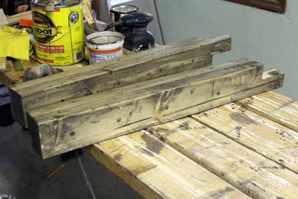
A post-stain picture.

The distressing was pretty fun.  We used both sides of some hammers, the sides of a screw being wacked by a hammer, and this metal right angle frame for drywalling that is for some reason in the basement to get just the right amount of destruction.


Milo and Gus got the idea.


Ari doesn't like loud noises, though.

We thought it'd be easier to sand and stain before assembling the legs, apron frame, and top.  But sanding is so boring.


Unless you're Gus.  Then you get into it.


Since the table was clearly going to be very heavy, I decided to assemble the pieces in the kitchen.  So after Gretchen stained all the parts, I brought them to the kitchen.


There were many right angles to verify.  Once the leg was positioned I used three countersunk 2.5" deck screws to attach each leg to the apron - one screw into the long apron and two into the short, sunk into two sides of the leg notch.


Rotate and repeat.


While it may be hard to see in this picture, this is when I realized an aesthetic problem.


Here's a close up of one of the legs and how I didn't do so well cutting that notch at exactly 1.75".  Close, but no cigar.


Fortunately, the trusty Ridgid multitool could fix my sloppiness.


After much wood shavings and sand paper, all four legs were more flush to the apron than before.


Much better!  Good thing we had leftover stain.

Next, to attach the top.  Careful measuring to make sure the countersunk screws didn't miss the apron ... there was a 2 inch overhang and the narrow side of a 2x4 to hit the middle of.  So 2 inches plus half of 1.5 inches gives you 2.75 inches.


Three countersunk screws evenly spaced on each of the four sides of the table


a few more wood plugs, and a bit more stain and you've got yourself a table.

Slap on the polyurethane, attach some threaded furniture glides to the legs, and sit down to eat!

Update:  The table turned out a bit wobbly, which makes me sad.  I think my notched leg construction was not the best idea.  I thought of adding a diagonal brace inside each apron corner - you know, like real tables - but decided to try reinforcing with a few extra screws going from the legs up into the bottom of the table top.  Here's a few of the underside - two screws per leg.  That has made a significant difference for now.  Hopefully forever.


Linking with:
The Creative Connection
The Shabby Nest's Frugal Friday
Miss Mustard Seed's Furniture Feature Friday
The Inspiration Gallery
Monday Funday